Overview
Songkick's existing design system, called Roadie, had existed in Figma for a while, though it was rarely used. Engineers and designers were routinely rebuilding components and setting new styles from scratch rather than reusing from the library. This led to component divergence and friction that threatened delivery speed.
I initiated and led a cross-functional initiative to create a unified component library—Roadie 2.0—starting with comprehensive Figma and code audits, and working closely with engineering partners to systematize tokens across Native and React Native codebases.
Approach
I brought engineering partners on board early, starting a weekly cross-functional working group to ensure any efforts would be in line with both design and engineering goals.
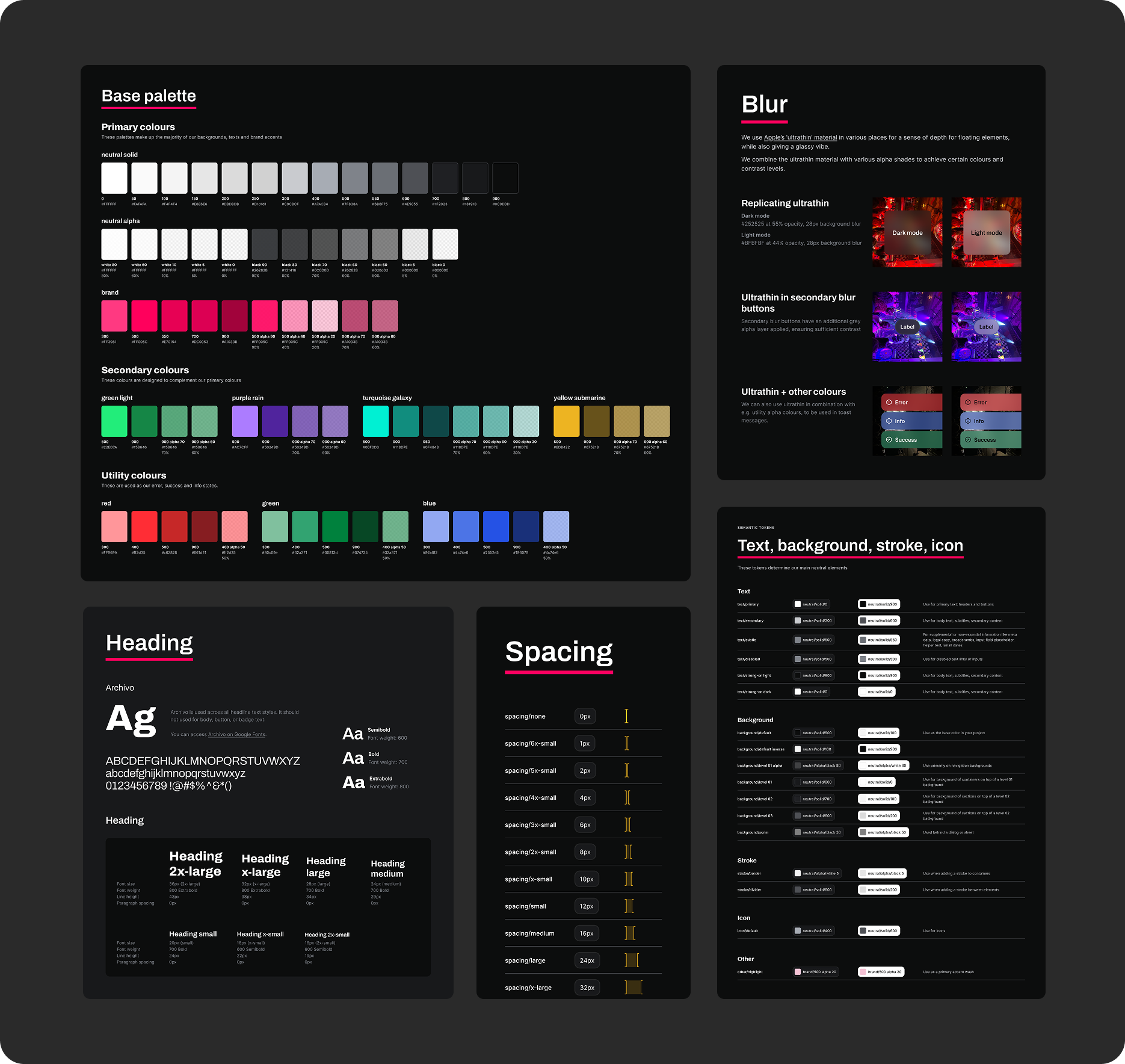
Our first step was to conduct comprehensive Figma and code audits across React Native and Native (iOS/Android) codebases, with the goal to eventually maintain one design source in Figma, and three consistent code implementations.
Our initial audits found big inconsistencies in both design and code.
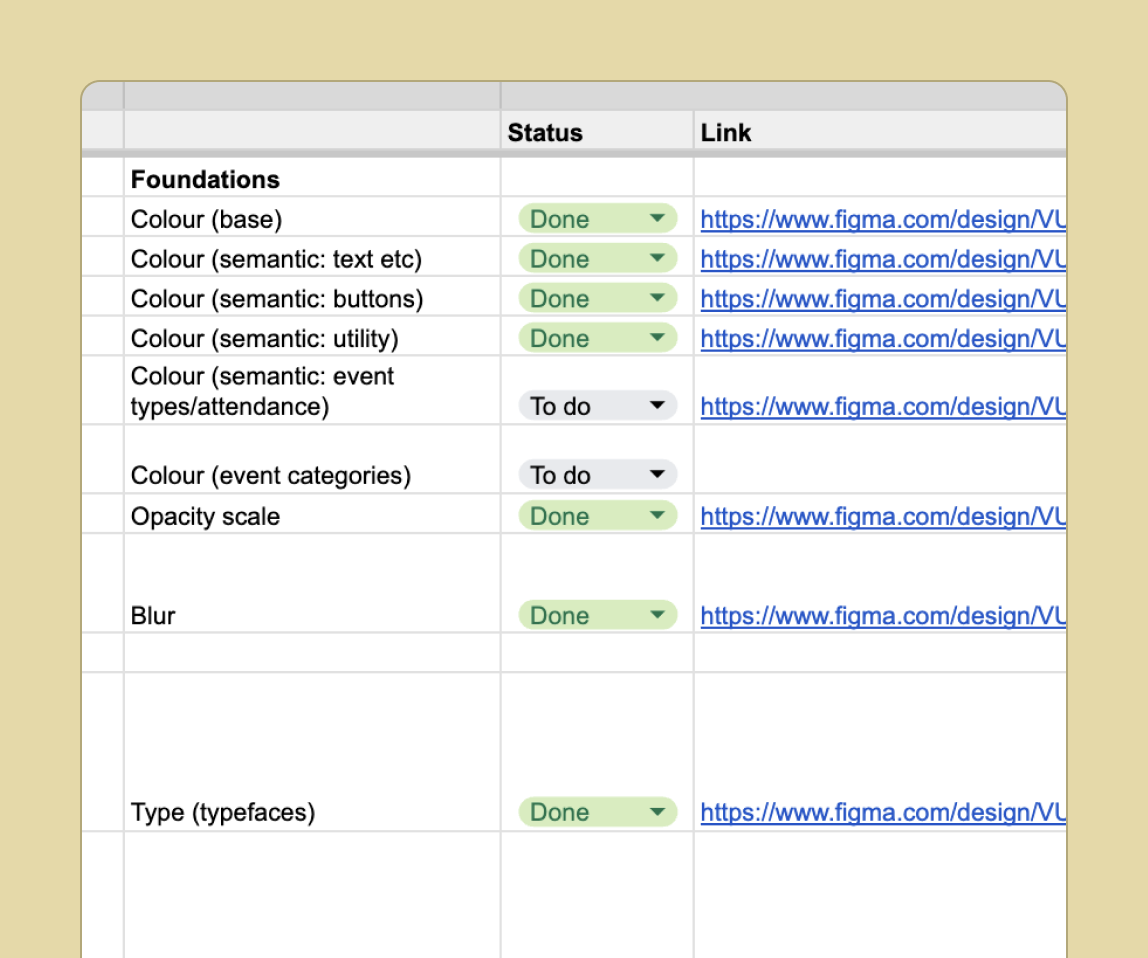
For speed and ease, we tracked our progress in a spreadsheet.
Cross-platform parity
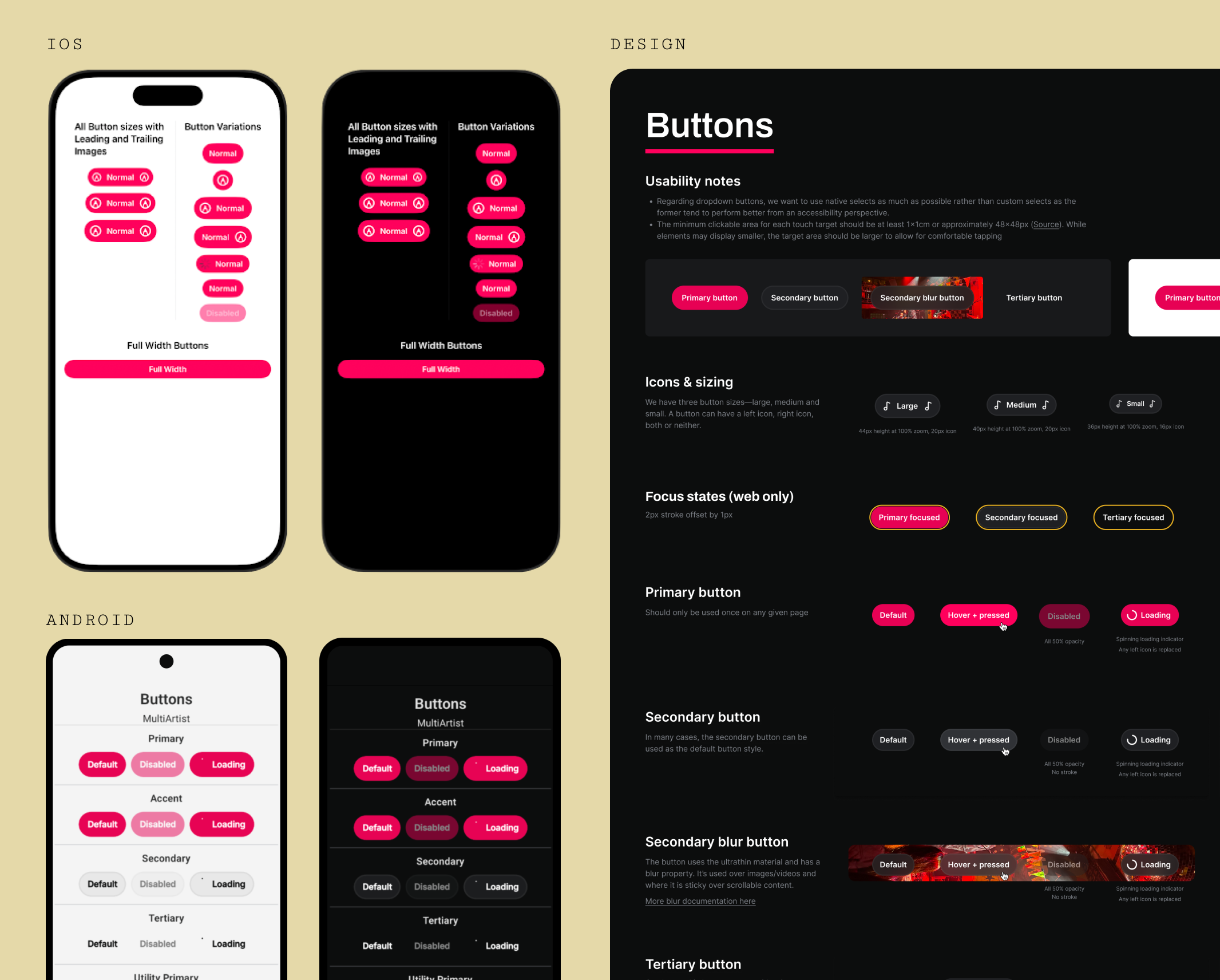
The central challenge was designing a unified system that served both the React Native team and the Native team—three distinct codebases with different technical constraints and conventions.
I established rigorous cross-functional governance to link a single design source in Figma to all three implementations. Platform-specific limitations relating to blur, stroke transparency, and modal behavior were proactively addressed and documented as exceptions rather than workarounds, allowing us to maintain maximum platform parity without compromising component quality.
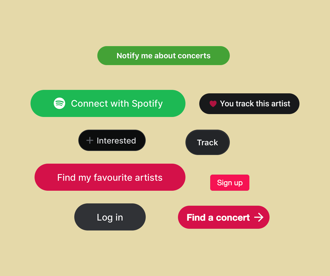
Roadie in action: leveraging color tokens
During the promotional window for a major artist's album release, the business asked for a visual reskin of the artist's superfan app to match the album's distinct pink color palette. Previously, this would have required designers and engineers to manually update hundreds of individual instances one by one—days of work.
Leveraging the new design system, we were able to treat this as a simple theming exercise: only needing to change 3 core color tokens within our shared library. The change instantly and consistently propagated across hundreds of instances on both Android and iOS.
While not a major feature by any means, this moment of delight was noticed and appreciated by our audience—as one user wrote: "Okay so, now I have every single button in pink on my iPad... and I just wanna say it's so cute 🥰🥰 App Gods, love that!"
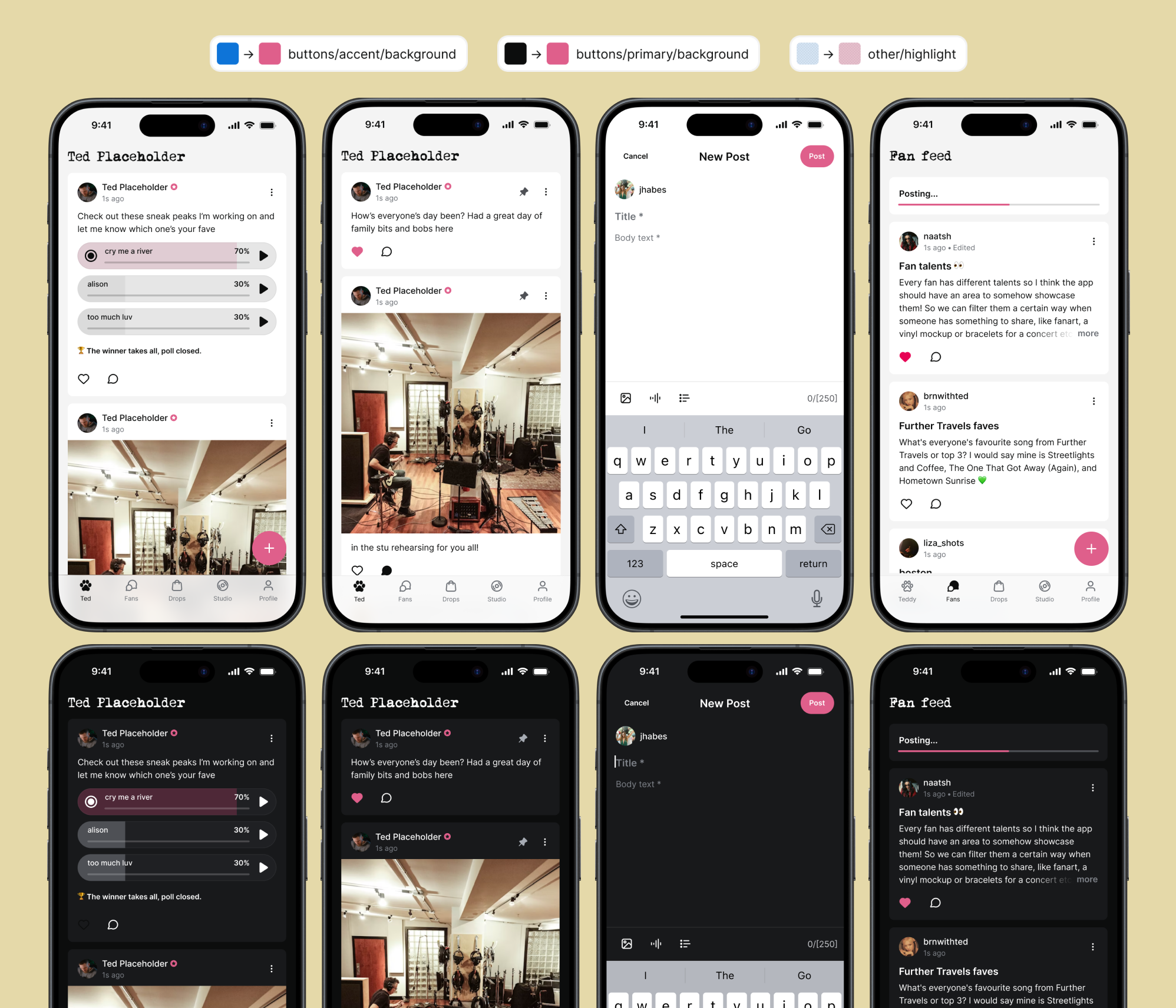
3 token changes → full-app reskin across iOS and Android, deployed in hours instead of days
Outcomes
The new system is now up and running, and getting great feedback from the entire team:
"The biggest area of improvement is we can quickly map the Figma to the code, so we don't need to look into the specific values for color hex codes, opacity, etc." — iOS Lead
"I deleted a ton of code because of the design system. It's been a game changer for us." — iOS Engineer
"Love the new design system. Not easy to design for two apps at the same time but it looks amazing and is super easy to use." — Android Lead